
Project Details
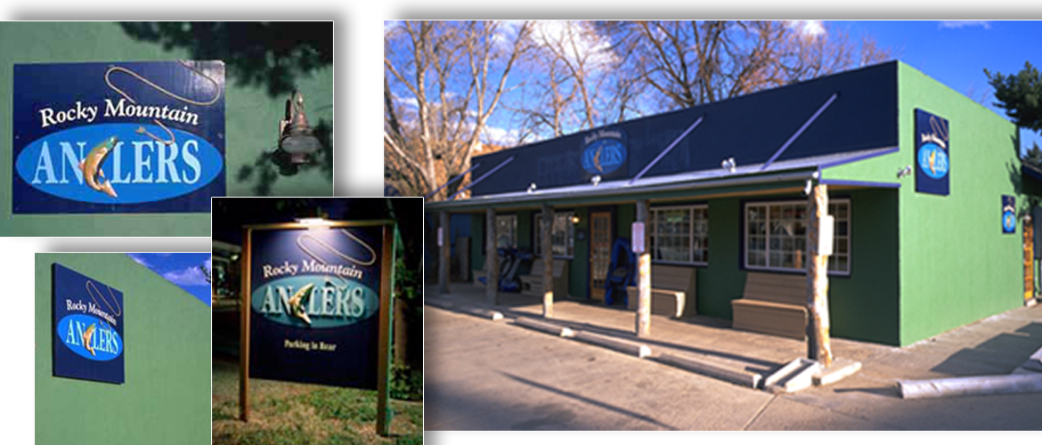
The market for this retail shop included experienced and non-experienced anglers located in and around Boulder County, and visiting anglers looking for guided trips in Colorado. Because this was a new retail shop in a new location, the logo signage and shop needed to stand out and appeal to all anglers from beginners to experienced. Like all identity programs, the graphics had to communicate in a consistent manner to reinforce the message. Teal blue and brown were the two colors used on the logo.The logo was applied to the stationery where the logo was printed on one side and just a fishing line similar to the line in the logo on the backside of the letterhead, envelopes and business cards.
The home page was designed to have the fish jumped out of the logo as the page is opened. The signage and building colors utilized a dark blue and green. Added were tan seats and post on the front porch to mimick a fishing shack. A dimensional fish and rope was detailed in the drawings for the signage company. The logo and stationery won the American Corporate Identity Award and was featured in their publication.
Our responsibilites included project management, design concept and development, coordination of illustrations, printing, exterior painting sign fabrication and selection of all vendors.