Project Details
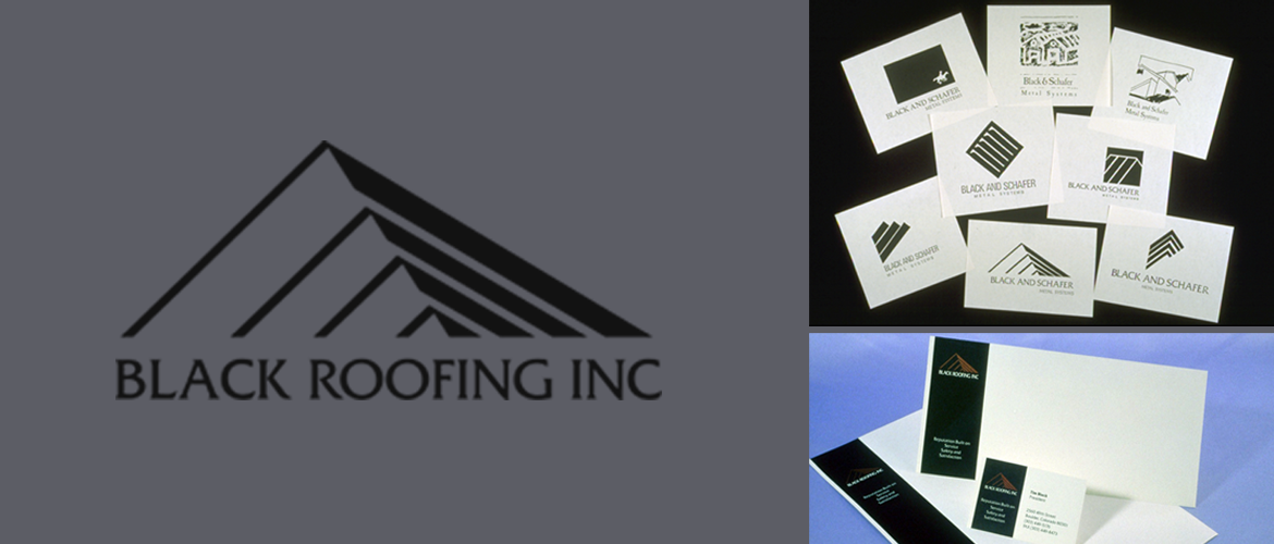
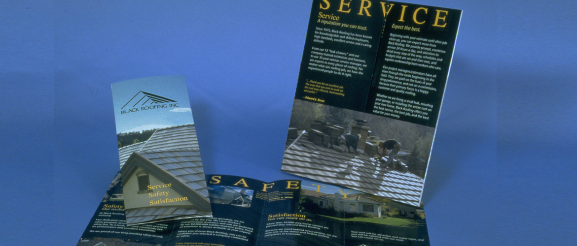
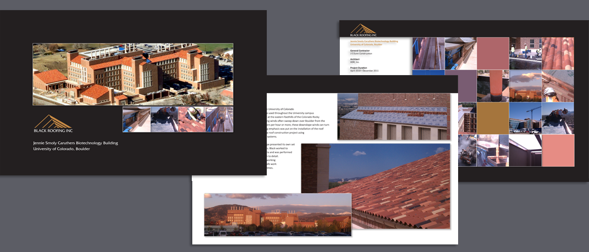
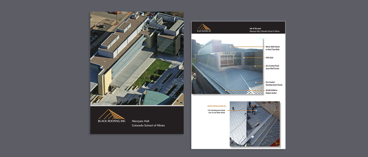
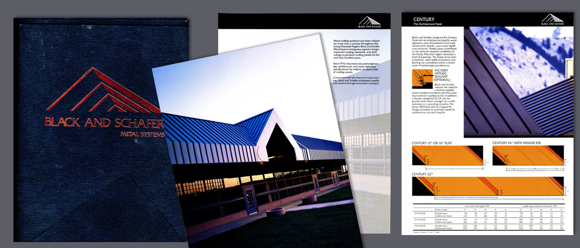
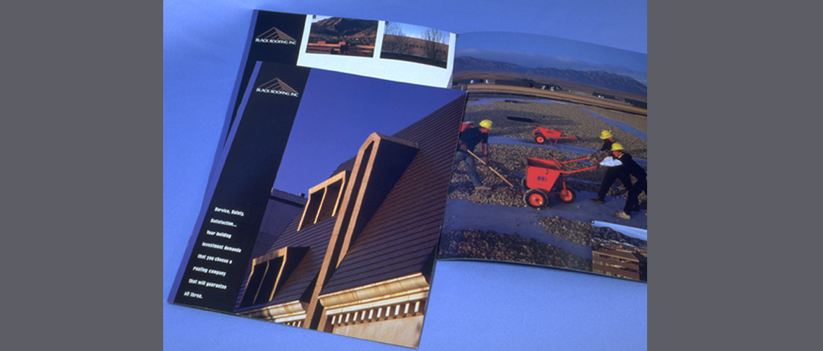
This client wanted a new identity for an established roofing company. Initially the client wanted a mark that had a western/cowboy look, after presenting other options this sleek mark was selected. With all of their collateral, a strong visual identity, with a representation of quality and service not only for residential roofing but also for the commercial industry. The target audience was Commercial Building Owners, Architects, Contractors and Residential Customers. As part of a strong visual identity, it was important to represent quality and service, for residential roofing, but also for future expansion into the commercial industry. The graphics had to appeal to this company’s very specific target audience in the building industry. In addition, a consistent design format was necessary for use in all printed materials to reinforce the visual image. Finally, the printed brochures and direct mail piece needed to address the scope of roofing services provided by Black Roofing Inc.Black was chosen as the dominate color to emphasize the “Black Roofing” name. Color, paper stock, special printing effects and consistent use of the logo were reproduced on all printed material to emphasize the graphic identity of the company. The brochures had a strong photographic approach to describe the various types of roofing projects undertaken by the company. All signs and vehicle identification incorporated a large logo/type and had excellent readability from a distance, increasing exposure to potential clients. My team and I were responsible for all design and production of the graphic identity system. We coordinated with the copywriter, printers and photographers, prepared the artwork and supervised all aspects of printing.The company is now one of the top roofing companies in Colorado.
